Heatmap
A Visual Tool for Comparative Analytics
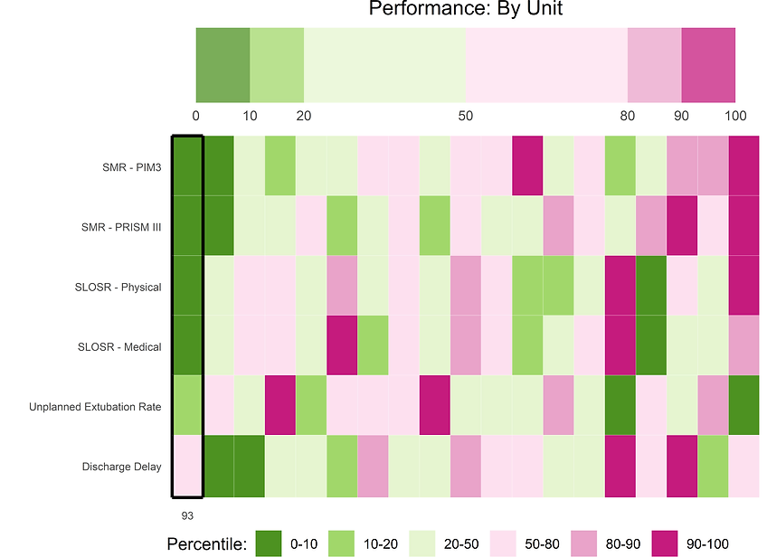
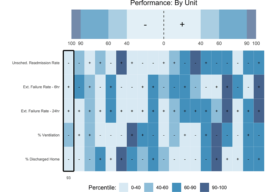
The Heatmap shows a visual comparison of multiple metrics among other hospitals in one snapshot. Metrics where low/high values are associated with low/high clinical or operational performance (i.e. length of stay) are called directional. Metrics where clinical meaning is linked to a comparison against a reference standard practice (i.e. unscheduled readmission rate) are called relative variables.


No particular metric can give an adequate picture of the quality of the work within an PICU. Nor is one unit a copy of another. Drivers behind excellence in one metric (extubation failure) can push against other metrics (unplanned extubation). The new heatmaps are a useful image of how effectively an intensive care unit balances the drivers behind the outcomes.

Paul Bauer, MD
Children’s Mercy Hospital
The heat map is really innovative and is a great way to check in with our unit’s performance in key quality metrics. The fact that it uses a colorblind-friendly palette shows how attentive to detail they are, and how important their clients are to them.
 Steven L. Shein, MD, FCCM
Rainbow Babies and Children’s Hospital


